Scales in D3
In the previous chapters, we learnt how to create a simple SVG chart with D3. In this chapter, we will learn to create scales and axes for the chart.
In our examples so far, when we wanted to draw shapes driven by our data values, we added a scaling factor to our data values. This was to ensure that our shapes are visible on the screen. Data values may not always correspond to pixel values on the screen. Some data values may be too large while others too small, to be used directly with pixel values.
D3 Scales provide a convenient solution to this. They map our data values to values that would be better represented in visualizations. D3 provides the following scaling methods for different types of charts.
| Scale Type | Method | Description |
|---|---|---|
| Continuous | d3.scaleLinear() | Construct continuous linear scale where input data (domain) maps to specified output range. |
| d3.scaleIdentity() | Construct linear scale where input data is the same as output. | |
| d3.scaleTime() | Construct linear scale where input data is in dates and output in numbers. | |
| d3.scaleLog() | Construct logarithmic scale. | |
| d3.scaleSqrt() | Construct square root scale. | |
| d3.scalePow() | Construct exponential scale. | |
| Sequential | d3.scaleSequential() | Construct sequential scale where output range is fixed by interpolator function. |
| Quantize | d3.scaleQuantize() | Construct quantize scale with discrete output range. |
| Quantile | d3.scaleQuantile() | Construct quantile scale where input sample data maps to discrete output range. |
| Threshold | d3.scaleThreshold() | Construct scale where arbitrary input data maps to discrete output range. |
| Band | d3.scaleBand() | Band scales are like ordinal scales except the output range is continuous and numeric. |
| Point | d3.scalePoint() | Construct point scale. |
| Ordinal | d3.scaleOrdinal() | Construct ordinal scale where input data includes alphabets and are mapped to discrete numeric output range. |
Let's say we have the following data that gives you the share value of a company over the past 6 years: [100, 400, 300, 900, 850, 1000]. In this case, our data values are too big to be displayed as pixels on the screen! To fix this, we may think of reducing the values by multiplying them with a factor such as 0.5 or 0.2. Instead, we can use d3.scaleLinear function to do this for us. This will create a quantitative linear scale. (d3.scaleLinear was introduced in version 4 of D3. In the earlier versions, it was denoted as d3.scale.linear.)
Before we use d3.scaleLinear function, we first need to understand two terms: Domain and Range.
Domain
Domain denotes minimum and maximum values of your input data. In our data [100, 400, 300, 900, 850, 1000], 100 is minimum value and 1000 is maximum value.
So, our domain is [100, 1000]
Range
Range is the output range that you would like your input values to map to.
We may not have enough space to display a bar chart for the above values, if we map our data values to pixels. Let's say we want to display a chart in SVG within 500 px width. So, we would like our output range between 50 to 500, where minimum value will be mapped to 50 and maximum value will be mapped to 500 that is [50, 500]. That would mean, an input value of 100 would map to an output value of 50. And an input value of 1000 would map to an output value of 500. It means scaling factor is 0.5 and the data will be represented in pixels as: data value * 0.5.
100 -> 50
1000 -> 500
So, now if our input value is 300, the output value would be 150.
Linear Scale
Let's use d3.scaleLinear function now. We will work with the horizontal bar chart example from the previous chapter. We had used a scaling factor of 10 to increase the width of bars in pixels because data values were too small var data = [5, 10, 12];.
But now that we have learnt how to work with scales, instead of multiplying a scaling factor to the data values, we will use the d3.scaleLinear function.
Let's use the above dataset to create our bar chart: var data = [100, 400, 300, 900, 850, 1000]; and use the d3.scaleLinear to do the scaling for us as shown below.
var data = [100, 400, 300, 900, 850, 1000];var scale = d3.scaleLinear() .domain([100, 1000]) .range([50, 500]);Above, we created a linear scale variable with the domain values [100, 1000] where 100 is the minimum value and 1000 is the maximum value in our data array and the output range is [50, 500]. So, we mapped our minimum data value to the output value 50, and maximum value 1000 to 500. The values between 100 to 1000 will be calculated automatically using the above scale function. Please note that a variable scale is a conversion function which will return output value according to the specified domain and range. We can pass any value between 100 to 1000 to scale function, and it will return the output value. For example, scale(200) will return 100 or scale(350) will return 175.
In the above example, instead of providing minimum and maximum value for our domain manually we can use built-in d3.min() and d3.max() functions which will return minimum and maximum values respectively from our data array.
var data = [100, 400, 300, 900, 850, 1000];var scale = d3.scaleLinear() .domain([d3.min(data), d3.max(data)]) .range([50, 500]);Now, let's create a bar chart for our large data values using d3.scaleLinear() function as below.
<body>
<script>
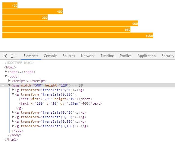
var data = [100, 400, 300, 900, 850, 1000]
var width = 500,
barHeight = 20,
margin = 1;
var scale = d3.scaleLinear()
.domain([d3.min(data), d3.max(data)])
.range([50, 500]);
var svg = d3.select("body")
.append("svg")
.attr("width", width)
.attr("height", barHeight * data.length);
var g = svg.selectAll("g")
.data(data)
.enter()
.append("g")
.attr("transform", function (d, i) {
return "translate(0," + i * barHeight + ")";
});
g.append("rect")
.attr("width", function (d) {
return scale(d);
})
.attr("height", barHeight - margin)
g.append("text")
.attr("x", function (d) { return (scale(d)); })
.attr("y", barHeight / 2)
.attr("dy", ".35em")
.text(function (d) { return d; });The above example will display the following result in the browser.
In the above example, the following code snippet defines the scale for our chart.
var data = [100, 400, 300, 900, 850, 1000];var scale = d3.scaleLinear() .domain([d3.min(data), d3.max(data)]) .range([50, 500]);We then use this scale function to set the width of rectangle bars as below. The scale(d) function call will return an output value for each value in the array.
g.append("rect")
    .attr("width", function (d) {
        return scale(d);
    })
.attr("height", barHeight - margin)Visit D3 Scales to learn more about it.
Learn how to create axes in the next chapter.