Create Pie Chart using D3
In this chapter, we will learn how to create pie charts with D3.
To create our pie chart visualization, we will be using the following D3 methods.
| D3 Method | Description |
|---|---|
| SVG Path | Creates a path in SVG from the defined commands. |
| d3.scaleOrdinal() | Creates an ordinal scale |
| d3.pie() | Creates an pie generator |
| d3.arc() | Creates an arc generator |
SVG Path
A path element is used to create a path on the SVG. The SVG path takes commands to draw paths in SVG.
<body>
<svg height="210" width="400">
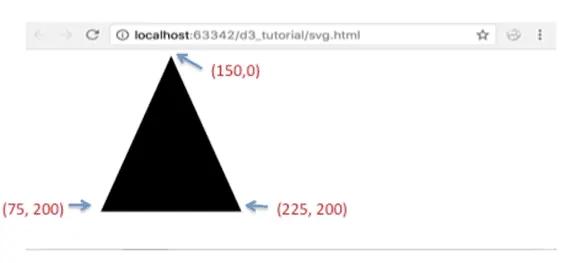
<path d="M150 0 L75 200 L225 200 Z" />
</svg>
</body>The above code defines the following path starting from the point (150,0), creates a line from (150,0) to (75,200), another line from (75,200) to (225,200) and finally a closing path to (150,0).
Learn more about SVG path here.
d3.scaleOrdinal()
We already learned about Scales in D3. The d3.scaleOrdinal() constructs a new ordinal scale with an empty domain and the specified range. In an ordinal scale, the order is of utmost importance and not the difference.
<body>
<script>
    var color = d3.scaleOrdinal(['#4daf4a','#377eb8','#ff7f00','#984ea3','#e41a1c']);
    console.log(color(0))
    console.log(color(1))
    console.log(color(2))
    console.log(color(3))
    console.log(color(4))
    console.log(color(5))
</script>
</body>
In the above example, the color variable will act as a scaling function which will return specified color for the specified index. For example, color(0) will return #4daf4a, color(1) will return #377eb8 color(2) will return #ff7f00 and so on. If a value at the specified index does not exists in the specified range then it will restart from 0. i.e. range does not contain element at 5th index (index starts with 0), so it will start again from 0 and will return #4daf4a.
You can read more about ordinal scale here.
d3.pie()
The d3.pie() function takes in a dataset and creates handy data for us to generate a pie chart in the SVG. It calculates the start angle and end angle for each wedge of the pie chart. These start and end angles can then be used to create actual paths for the wedges in the SVG.
Consider the following example.
<script>

    var data = [2, 4, 8, 10];
    var pie = d3.pie()
    console.log(pie(data))

</script>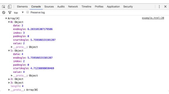
In the above example, we defined a d3.pie() object and provided our data to the pie function. This function calculated certain fields for the pie chart like startAngle and endAngle along with the data values.
d3.arc()
The d3.arc() generates an arc. These are the paths that will create our pie's wedges. Arcs need an inner radius and outer radius. If the inner radius is 0, the result will be a piechart, otherwise the result will be a donut chart. We need to supply these generated arcs to our SVG path elements.
The following example demonstrates a simple pie chart.
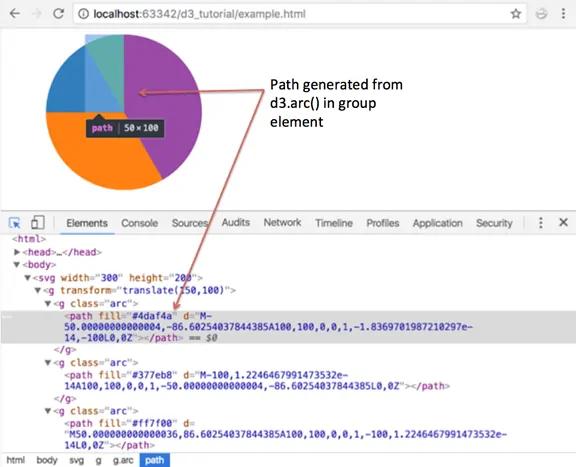
<body>
<svg width="300" height="200"> </svg>
<script>
    var data = [2, 4, 8, 10];

    var svg = d3.select("svg"),
        width = svg.attr("width"),
        height = svg.attr("height"),
        radius = Math.min(width, height) / 2,
        g = svg.append("g").attr("transform", "translate(" + width / 2 + "," + height / 2 + ")");

    var color = d3.scaleOrdinal(['#4daf4a','#377eb8','#ff7f00','#984ea3','#e41a1c']);

    // Generate the pie
    var pie = d3.pie();

    // Generate the arcs
    var arc = d3.arc()
                .innerRadius(0)
                .outerRadius(radius);

    //Generate groups
    var arcs = g.selectAll("arc")
                .data(pie(data))
                .enter()
                .append("g")
                .attr("class", "arc")

    //Draw arc paths
    arcs.append("path")
        .attr("fill", function(d, i) {
            return color(i);
        })
        .attr("d", arc);
</script>
</body>This will result in the following pie chart:
Let's walk through the code:
var svg = d3.select("svg"), width = svg.attr("width"), height = svg.attr("height"), radius = Math.min(width, height) / 2,We first define all our variables like width of the svg and, height of the svg. We calculate the radius as Math.min(width, height) / 2 to ensure that our generated pie will fit into the bounds of the SVG. For this, we choose whichever of the width and height is the minimum value.
g = svg.append("g").attr("transform", "translate(" + width / 2 + "," + height / 2 + ")");
The above code appended a group element to our SVG to group all the pie elements together.
var color = d3.scaleOrdinal(['#4daf4a','#377eb8','#ff7f00','#984ea3','#e41a1c']);
Next, we define our color scale as an ordinal scale. When we pass an index of a value in data array to the color scale, it will return the corresponding color value.
var pie = d3.pie();
This will generate our pie values like startAngle and endAngle as seen in the previous example.
var arc = d3.arc() .innerRadius(0) .outerRadius(radius);Next, we define our arc with an inner radius of 0 and outer radius as the radius calculated earlier. This will be used to give paths to our pie wedges.
var arcs = g.selectAll("arc") .data(pie(data)) .enter() .append("g") .attr("class", "arc")Now, we create group elements for each of our data values. This group element will hold our individual paths or wedges.
arcs.append("path")
            .attr("fill", function(d, i) {
                <span className="kwrd">return</span> color(i);
            })
            .attr("d", arc);
And finally, we add a path element for each of our wedges. We provide the arc generated earlier and fill it with a color from our color scale.
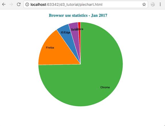
Let's now take a real dataset, read it from an external csv file and create a pie chart from this data.
For this example, we will take the following dataset that we have stored in a 'browseruse.csv' file. This dataset shows the browser statistics for a dummy website.
browser,percent
Chrome,73.70
IE/Edge,4.90
Firefox,15.40
Safari,3.60
Opera,1.00
Let's create our pie chart visualization for the above dataset.
<!DOCTYPE html>
<html>
<head>
    <style>
        .arc text {
            font: 10px sans-serif;
            text-anchor: middle;
        }

        .arc path {
            stroke: #fff;
        }

        .title {
            fill: teal;
            font-weight: bold;
        }
    </style>
    <script src="https://d3js.org/d3.v4.min.js"></script>
</head>
<body>
    <svg width="500" height="400"></svg>
    <script>

        var svg = d3.select("svg"),
            width = svg.attr("width"),
            height = svg.attr("height"),
            radius = Math.min(width, height) / 2;

        var g = svg.append("g")
                   .attr("transform", "translate(" + width / 2 + "," + height / 2 + ")");

        var color = d3.scaleOrdinal(['#4daf4a','#377eb8','#ff7f00','#984ea3','#e41a1c']);

        var pie = d3.pie().value(function(d) {
                return d.percent;
            });

        var path = d3.arc()
                     .outerRadius(radius - 10)
                     .innerRadius(0);

        var label = d3.arc()
                      .outerRadius(radius)
                      .innerRadius(radius - 80);

        d3.csv("browseruse.csv", function(error, data) {
            if (error) {
                throw error;
            }
            var arc = g.selectAll(".arc")
                       .data(pie(data))
                       .enter().append("g")
                       .attr("class", "arc");

            arc.append("path")
               .attr("d", path)
               .attr("fill", function(d) { return color(d.data.browser); });

            console.log(arc)

            arc.append("text")
               .attr("transform", function(d) {
                        return "translate(" + label.centroid(d) + ")";
                })
               .text(function(d) { return d.data.browser; });
            });

            svg.append("g")
               .attr("transform", "translate(" + (width / 2 - 120) + "," + 20 + ")")
               .append("text")
               .text("Browser use statistics - Jan 2017")
               .attr("class", "title")
    </script>
</body>
</html>
The above code will display the following pie chart.
Let's walk through the code:
We start by defining our variables like before:
var svg = d3.select("svg"), width = svg.attr("width"), height = svg.attr("height"), radius = Math.min(width, height) / 2, g = svg.append("g").attr("transform", "translate(" + width / 2 + "," + height / 2 + ")");var color = d3.scaleOrdinal(['#4daf4a','#377eb8','#ff7f00','#984ea3','#e41a1c']);Next, we generate the pie. Since we want to plot the percentage values, we have used an anonymous function to return d.percent and set it as the pie value.
<span className="kwrd">var</span> pie = d3.pie()
        .value(function(d) { return d.percent; });
Next, we define our arcs for each of the pie wedges. This arc will be set to the path elements. We provide the calculated radius to the outerradius and innerradius is set to 0.
var arc = d3.arc()
            .outerRadius(radius)
            .innerRadius(0);
In addition to the wedges, we are also showing labels for the different browsers. We have this data in the 'browser' attribute in our dataset.
Labels are also defined as d3.arc(). We can decide where to add the labels in our wedges by providing radius. You can tweak the values to see where your labels would look the best in your visualization. So the label looks like:
var label = d3.arc()
            .outerRadius(radius)
            .innerRadius(radius - 80);
Now that we have our arcs defined, lets read our dataset and start building the pie chart.
We load the data from 'browseruse.csv' and do the standard error handling.
d3.csv("browseruse.csv", function(error, data) {
d3.csv("browseruse.csv", function(error, data) {
    if (error) {
        throw error;
    }

  var arcs = g.selectAll(".arc")
            .data(pie(data))
            .enter().append("g")
            .attr("class", "arc");
We want to create group elements for each of the data values in our dataset. We also assign a class 'arc'to our groups.
 arcs.append("path")
    .attr(<span className="str">"d"</span>, arc)
    .attr("fill", function(d) { return color(d.data.browser); });
After adding groups, we now want to add our generated arcs to create paths for each of the pie wedges. We append a path element to the group, and provide the arc defined earlier to the path's “d” attribute. We also want our wedges to be colored using the color scale we defined earlier. So, we provide the style attribute "fill" and assign our color from the color range.
arcs.append("text")
    .attr("transform", function(d) {
            return "translate(" + label.centroid(d) + ")";
    })
    .text(function(d) { return d.data.browser; });
And finally, we append the browser labels to each of the group elements. We use the SVG text element for our labels. The label arcs that we created earlier using d3.arc()returns a centroid point which is handy to position our labels. So we use this to provide a translation point to our text label. And then we provide our data using d.data.browser.
svg.append("g")
   .attr("transform", "translate(" + (width / 2 - 120) + "," + 20 + ")")
   .append("text")
   .text("Browser use statistics - Jan 2017")
   .attr("class", "title")
We would also like to append a title to our visualization. We add another group element to hold this text. We apply a translation .attr("transform", "translate(" + (width / 2 - 120) + "," + 20 + ")") to position our text right above the pie chart. Next, we append the text element text("Browser use statistics - Jan 2017"). And finally, we apply a class'title'to color the text and make it bold.
.title {
    fill: teal;
    font-weight: bold;
    }
Thus, we created a pie chart from a dataset that was read from a csv file.
Donut chart
Using the same code with a small change, you can create a donut chart instead of a pie chart. Change the inner radius of the arc to use a value greater than zero:
var arc = d3.arc()
            .outerRadius(radius)
            .innerRadius(100);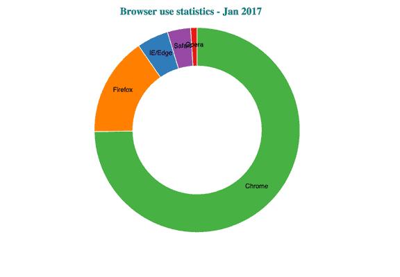
An innerRadius > 0 gives you a donut chart.